As some of you may remember, Showcase Properties of Central Florida went through a total rebrand at the beginning of 2017. While we loved our previous brand identity, we all agreed it was time to take a look at ourselves and make some updates. In doing this, our goal was threefold– honor our previous brand, acknowledge who we had grown into as a company, and also encapsulate the goals we have for our future. A very tall order to say the least! With this in mind, we designed a crest that lets the world know we’re here to help you reach your real estate goals– no matter what form they take.
Our logo includes a symbol known within Showcase as our ‘crest.’ Crests have been used for centuries by families, monarchs, and countries as symbols of identity and power. And no, they’re not just a Game of Thrones thing. These crests function as a visual shorthand to tell the world who you are, and what’s most important to you. Every element of a crest is loaded with symbolic meaning. Take a look at the components used to make the Showcase crest, and the meaning behind them:

The Laurel Wreath
The most eye-catching portion of the Showcase crest is easily the laurel wreath encircling the Showcase shield. An ancient symbol of victory, triumph, and personal excellence, laurel wreaths were awarded to Olympic champions in classical Greece, and later given to successful military commanders in Rome. Since then, the laurel has become an almost universal symbol of excellence and accomplishment, used in everything from academic commencement ceremonies to heraldry. To us, the wreath represents our commitment to excellence in every transaction we handle, and in every relationship that we build.

The Shield
An ancient tool used for protection, the shield has known many forms throughout history. In heraldry, the shield, or escutcheon, forms the main focal point within a coat of arms, allowing for other elements to take the lead. By its very nature, a shield symbolizes protection for those who bear it, safety, and tradition. For us, our shield represents our dedication to protecting and educating our customers throughout the real estate process. It also serves as a visual reminder to remember where we began, and appreciate how we’ve grown.
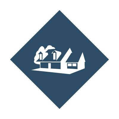
The House
The top left quarter of the Showcase crest represents our residential listings. It speaks of our passion for helping people not only find a house, but a place to call home here in Central Florida. The home is symbolic of our roots here in Marion County, and our commitment to helping you find the home of your dreams. Did you know? The home featured in our crest is adapted from a real home we had the opportunity to represent!

The Horse
The horse, featured in the top right quarter of the shield, symbolizes our specialty in agricultural and equestrian properties alike. Our team is active in a variety of ways with the local equine community, and deeply supportive of all breeds, disciplines, and equestrians who call Marion County home. For us, the horse represents the dedication we have to preserving and treasuring Marion County’s unique and thriving equine and agricultural community.

The Trees
Featured on the bottom left quarter of the crest are a set of trees, an old symbol of home, property, and life. These trees act a visual representation of our vacant land specialty and honors the beautiful natural spaces available right here in Marion County. This symbol is an invitation to explore the possibilities that come with raw land, and the ability to build your own legacy from the ground up.

The Cityscape
The final quarter of the shield, the bottom right, is a cityscape. The cityscape acts as a representation of the commercial property portion of our business. For us, the cityscape also acts to honor the entrepreneurial spirit of our independent brokerage, a support for other local businesses, as well as a reminder that Marion County is the perfect home for any business. Further, it also allows us to think into the future and dream about what we at Showcase Properties of Central Florida, as well as Ocala and Marion County, may grow into in the future.
The Colors
Our final piece of the crest, and an often-over-looked element, are the colors themselves. We think our colors of blue and white are exceptionally pretty, but they’re also much more than just aesthetically pleasing.
Blue, the color of both the sky and the sea, is a color of both depth and sincerity. Blue is associated with trust, loyalty, and stability– qualities we strive to bring to all of our customer relationships. We chose the Showcase blue in particular to help us symbolize responsibility and service, a trait demonstrated by each of our agents throughout their careers, as well as our attitude towards our customers and community.
White, the other standard color used throughout our branding, is a color with meaning in so many different cultures that it could probably fill up another few pages! For us, the white has a few meanings– in regard to real estate, white symbolizes fresh starts, new and continued friendships, and possibility. In our advertising, white is also used as a clean-slate that allows us to focus on clean design and clear messages.
All Properties. All Price Points. All For You.
We debuted our new branding on January 1st, 2017. We had some bumps along the way, and it took a long adjustment period. But in the end, we were able to create something that shows off our past, our present, and what we hope for the future. We created a logo to help customers remember that the best residential, agricultural, vacant land, and commercial specialists in Central Florida are ready and willing to help you every step of the way. We work with all properties. We work with all price points. And we do all this to better serve you. Contact us today to see how we can help.