We don’t always think about it, but color plays a huge role in our daily lives. The colors in the clothes we wear reflect our moods and how people perceive us, and the colors in traffic lights keep us safe on the road. Color is important in many aspects of our lives, but we perhaps notice it most chiefly in our surroundings. The color scheme of a room or even an entire house has the power to put us at ease or make us feel queasy, to make us feel bright and fresh or dark and oppressed. If you’re considering a repainting project for the interior of your home, keep these color tips in mind to give your home the exact kind of atmosphere you want.
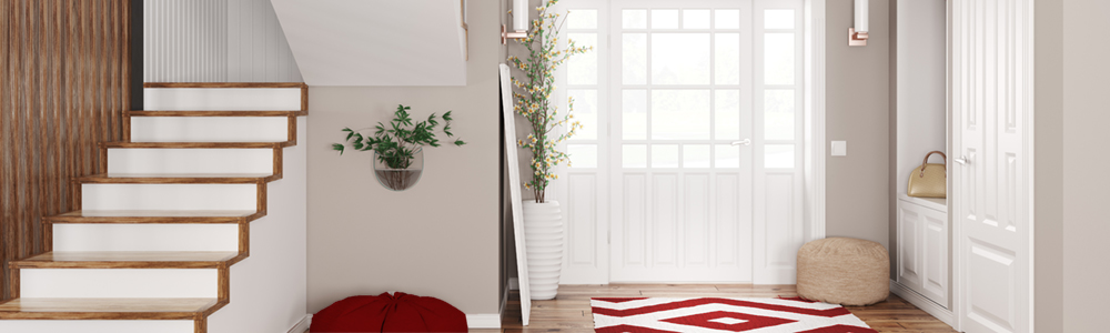
Foyer
The foyer is your home’s most impactful opportunity to make a lasting impression, and also sets the tone for the overall experience of your home. Be creative with this space and use it to let guests know who you are as soon as they walk through the door.
Black– Black is a gutsy choice, but it lends an atmosphere of power, mystery, and even sexiness. Paired with red and brass accessories, a black foyer adds an effortless and exotic zing.
Purples– Reddish purples like imperial and Tyrian purple are perfect for foyers. They’re warm without being too heavy, and when paired with lighter colors throughout the home give the impression of a house effortlessly unfolding.
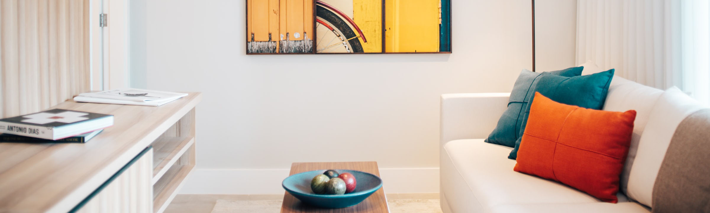
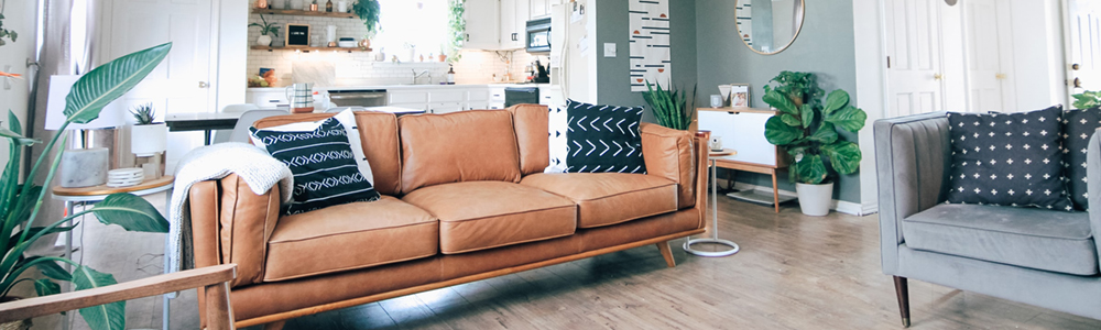
Living Room
Your home’s living room is both private and public space–the place where you hang out, entertain, and spend time with the people you love. It’s also likely one of the biggest rooms in the house, so whichever color you choose has the capability of deeply impacting the mood of whoever enters.
Greens– Lighter shades like pale mint are modern yet elegant, and create a living room that’s great for both entertaining and lounging. Brighter greens like lime work best in rooms that catch a fair amount of sun, and capture the light beautifully when contrasted with white or cream.
Oranges– Don’t knock it til you try it! Tangerine is quirky and artsy in the best way, and looks great with white and gold. Lighter shades like pale cantaloupe warm the space without sacrificing brightness or freshness, and feel breezily tropical.
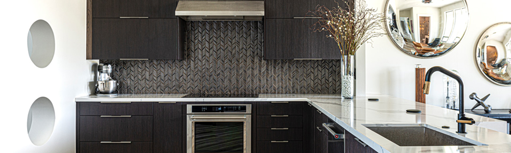
Kitchen
Kitchens tend to miss out on interior design love because they’re often viewed as purely utilitarian (they are the places where dishes happen. No one likes doing the dishes). Bring some easy creative attention to your kitchen with a few fresh coats of paint and it’ll become one of your favorite rooms in the house!
Blues– Royal blue in the kitchen strikes a balance between the homey and the elegant. Go with seafoam if you want the space to be more cool, fresh, and fun.
Black– A gorgeous choice when paired with light-colored countertops, black can transform a kitchen from a utilitarian wasteland into a dramatic entertainment space no guest will want to miss.
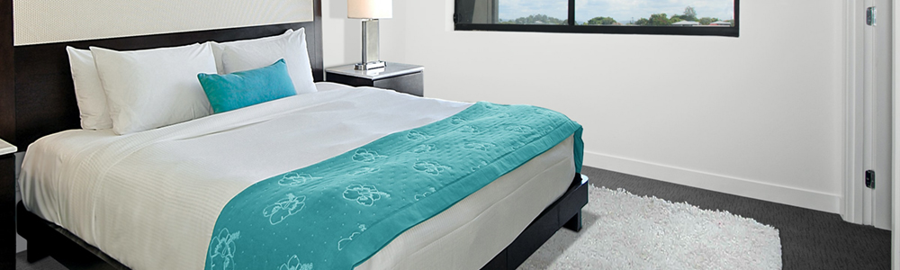
Bedrooms
Scientifically speaking, you will likely spend close to a third of your life sleeping. If you’re going to spend that much time in your bedroom, you may as well make an extra effort to turn it into your personal sanctuary–a place to relax, recharge, and shut out the stresses of the world.
Greys– Most shades of grey are perfect for the bedroom, but aloe and khaki grey work especially well. Aloe is a very pale grey-green that appears green during the day and darker grey at night. Khaki has a cooling effect and looks wonderful with white, cream, and silver.
Blues– Pale blue is bright yet tranquil, and works well with most colors. Slightly more saturated sky blue gives the room an atmospheric, dreamy feel and makes darker decor pop.
Reds– It’s a common rule of thumb to avoid reds in the bedroom because of the energy they generate. However, burnt, dull reds are a happy medium that lend cozy warmth without becoming overpowering.